My Account - Notifications

Web + Mobile Design
Project Overview
Allow doctors to manage the notifications they receive on My Account and its mobile app, which are portals for dentists to send in dental orders to our lab.
My Contributions
Led the end-to-end design of notification settings in both My Account and its mobile app.
My Account - Notifications
Lead UX Designer
April 2025
The ChallengeOn average, a doctor receives ~40 emails per week regarding changes in the status of their cases and there is no way to manage the types of emails they receive (not even the ability to unsubscribe), which results in many complaints from our customers.
Key Problems to Solve
  • Identify and prioritize the types of notifications to display on My Account and the Glidewell mobile app

  • Make the solution scalable for the Glidewell Mobile App

  • Provide a way for doctors to manage their email notifications in My Account


The Solution
A notification settings page was designed in both My Account and the Glidewell mobile app to allow doctors to turn on/off case and billing related notifications.


Insights
In our workshop, we had stakeholders dot vote which case updates deserved a notification. Our analysis of the dotting voting determined that the following case statuses would be a notification:
  • Received (7 red dots)
  • On Hold (6 red dots)
  • Shipped (5 red dots)
  • Delivered (6 dots)
Two additional case updates were deemed necessary and added after the fact:
  • Ready for Review
  • Daily Case Summary
To better understand the frequency in which users would receive notifications, I sought out data to understand the average case volume a customer had at a given time. I found that it is not common for doctors to have a high volume of cases (i.e. 7+ cases)

50.5% of accounts have 1 case open on a given day
90.05% of accounts have 1- 4 cases open on a given day

Explorations
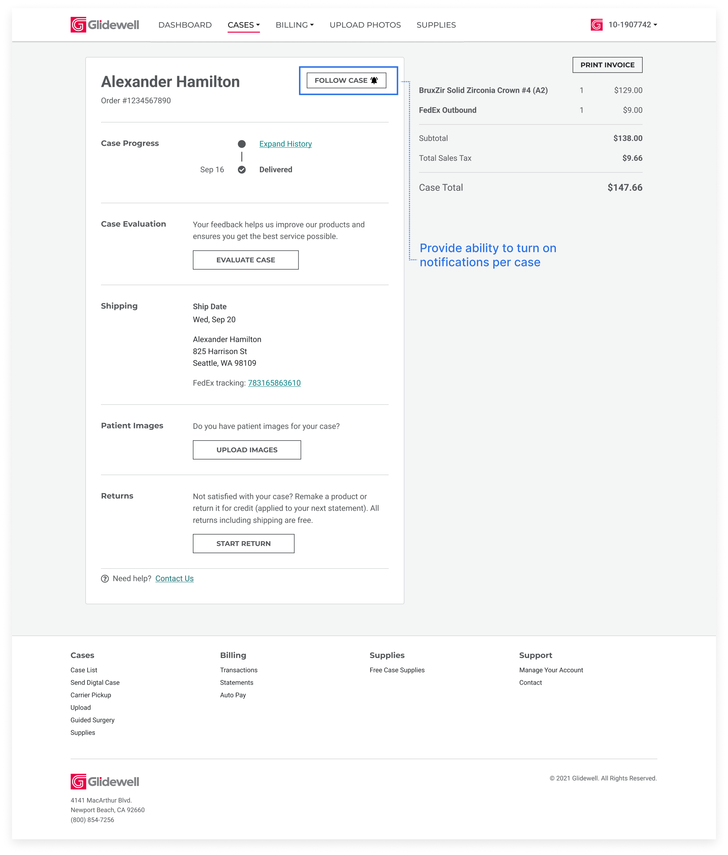
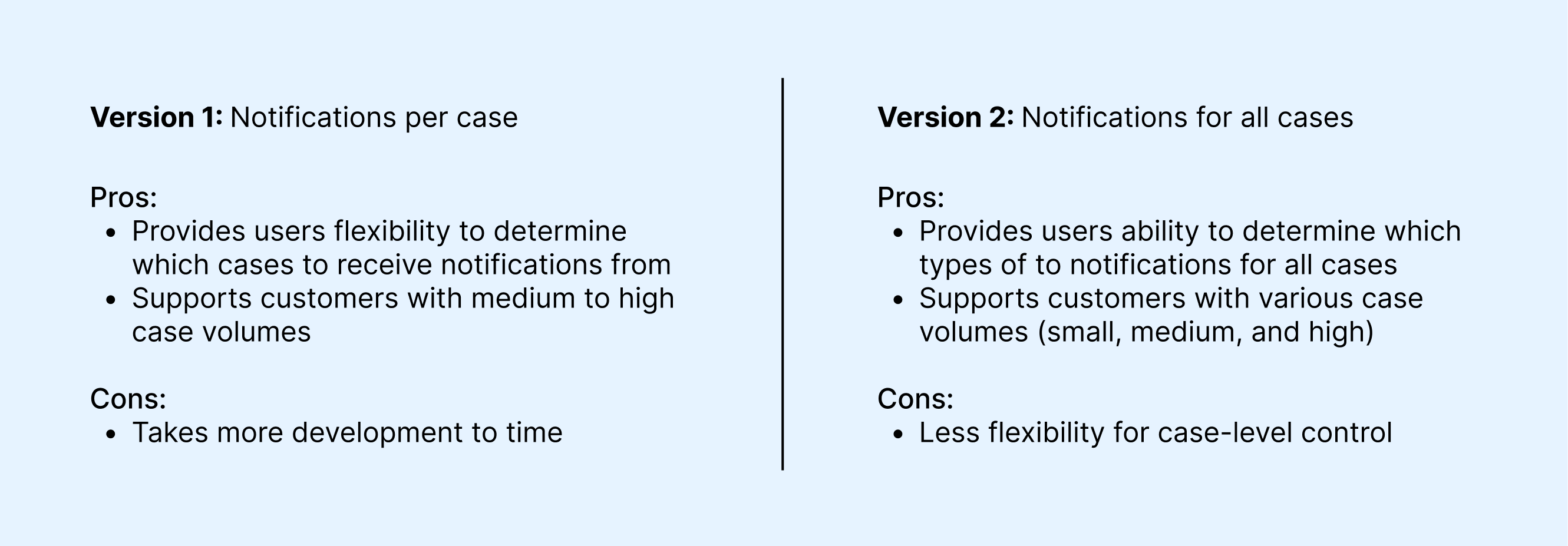
Version 1: Allow doctors to select whether they want notifications turned on per case

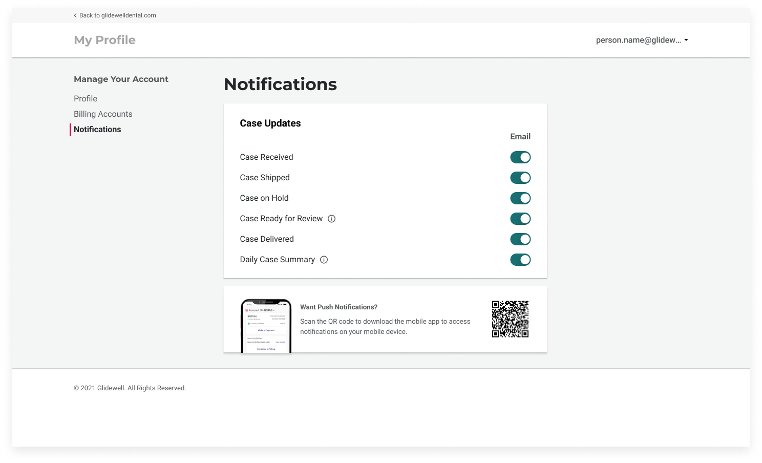
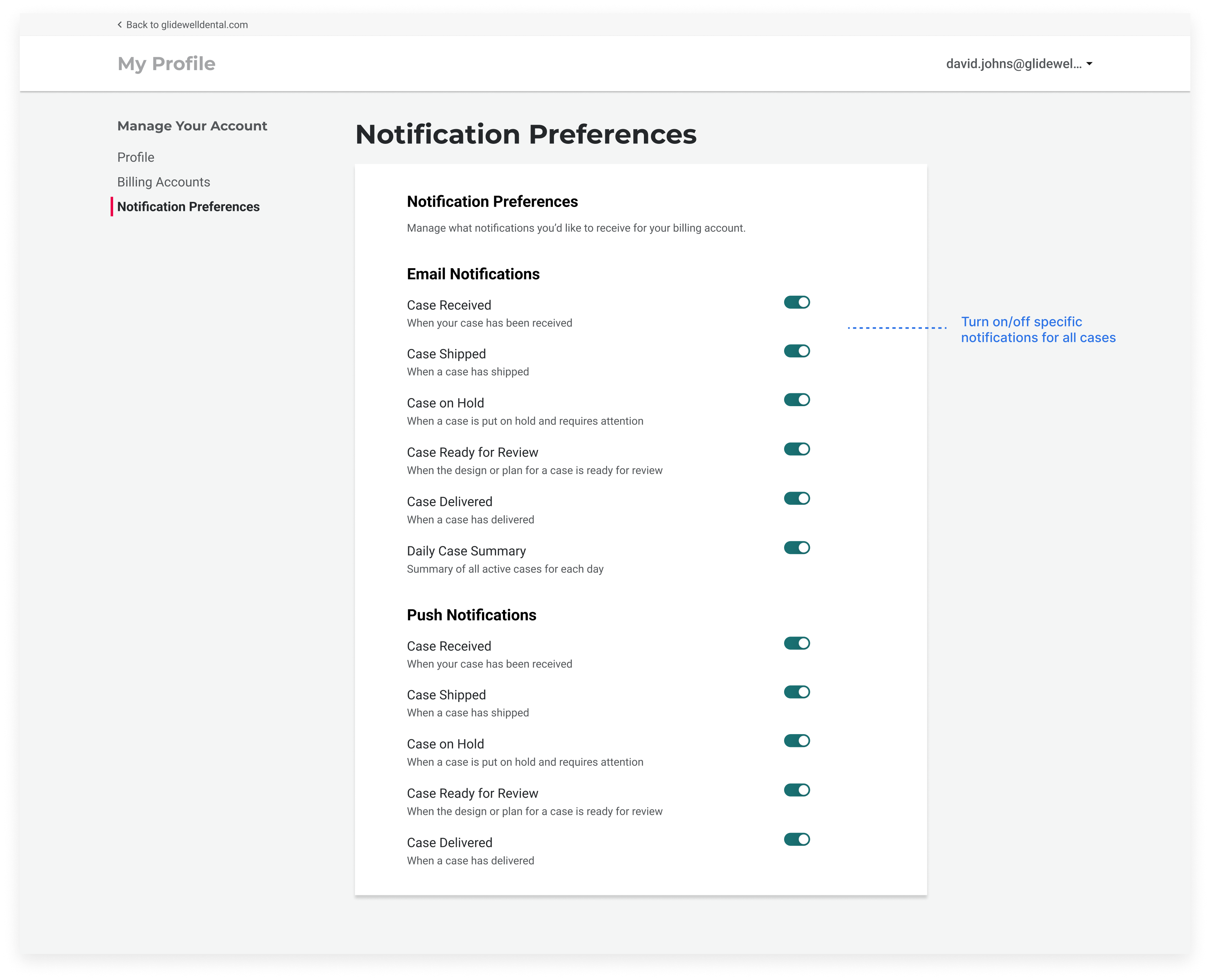
Version 2:  Notifications page in Settings to all doctors to choose case notifications to receive for all their cases

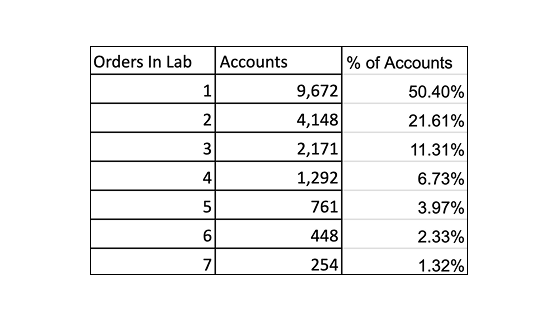
DecisionAfter weighing the pros and cons of each design, I ultimately went with Version 2, providing ability to turn on/off specific case notifications. Version 2 was most flexible in supporting customers with various case volumes and data shows majority of dentists have a small case volume with a few exceptions.


Iterations for Version
I questioned whether users would go to the web app to manage push notifications for the mobile app. As a result, I decided the scenario would be less likely on the web app and took it out from the settings page.

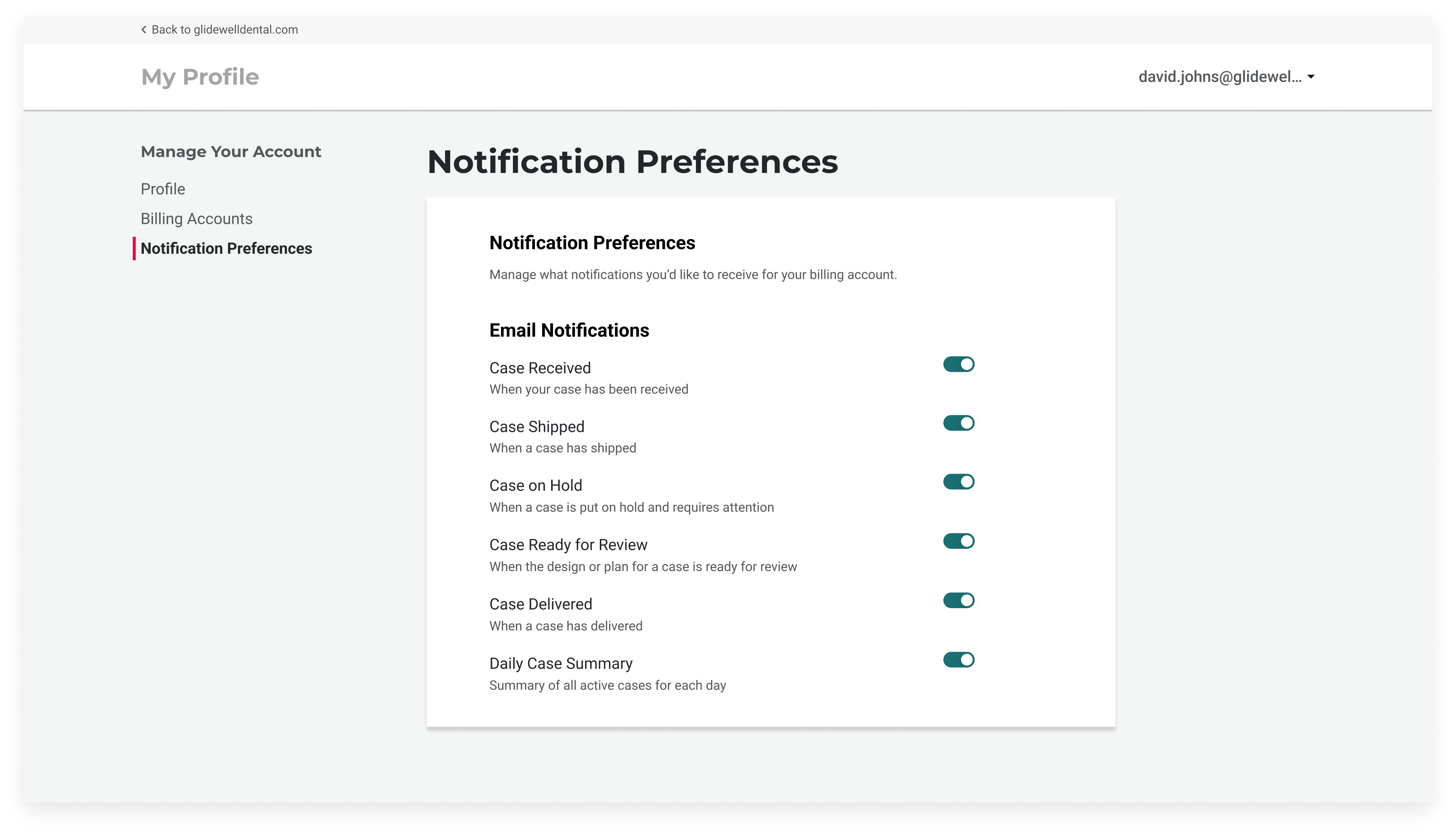
Streamlined the notifications page to reduce cognitive load by removing unnecessary text. Any case updates that needed an explanation were accessible via a tooltip


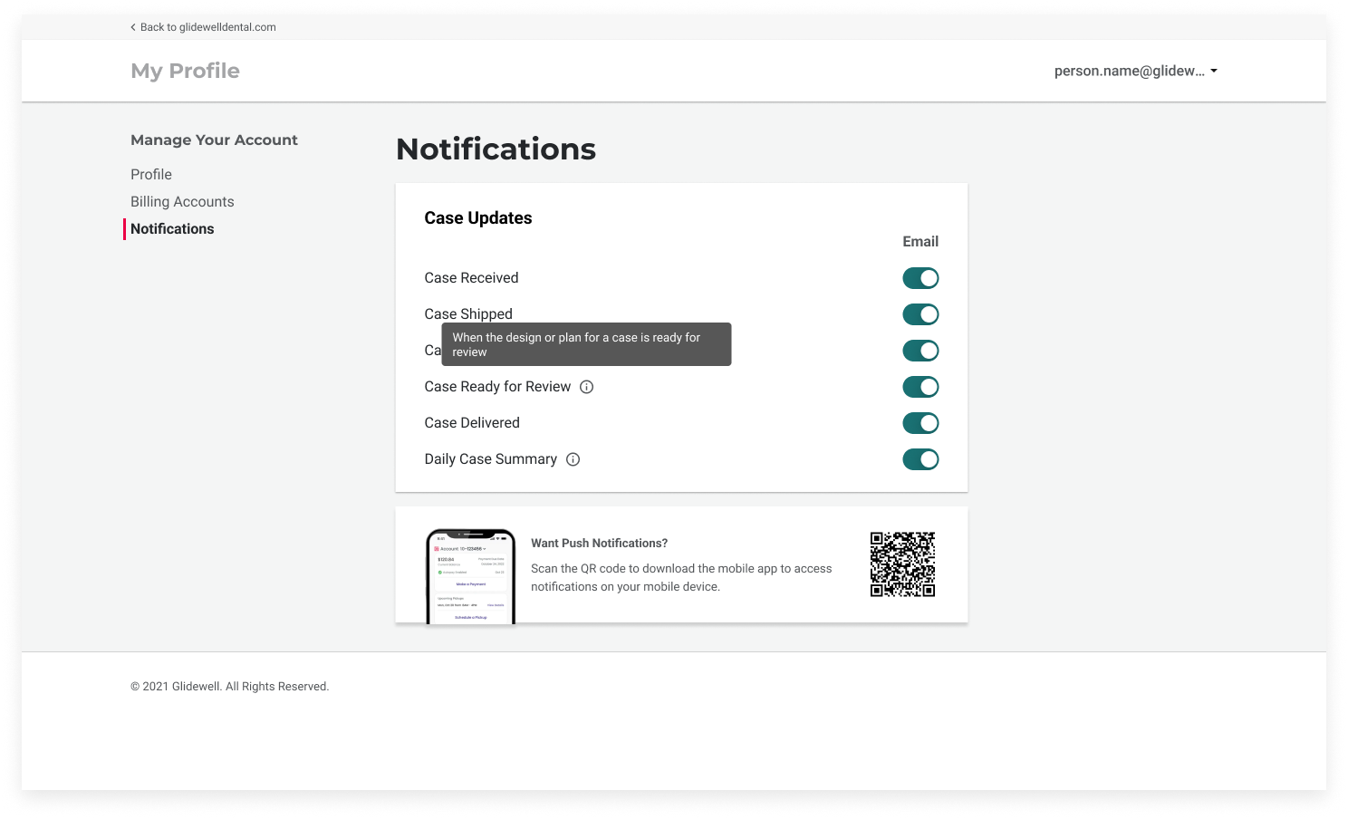
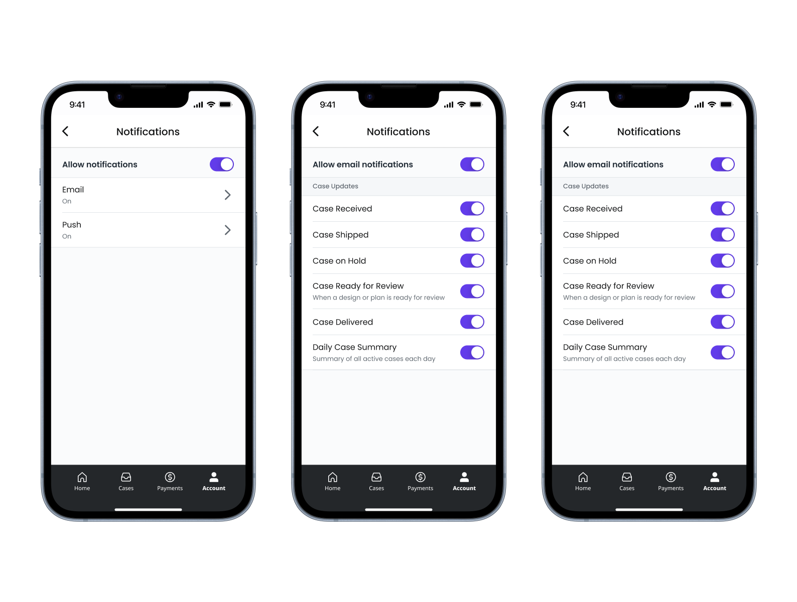
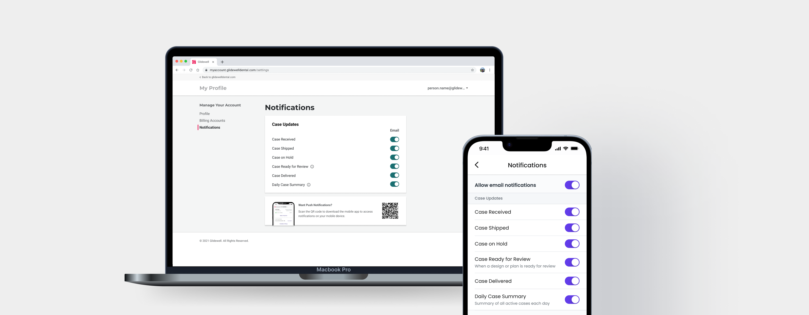
Translating Notifications Management to the Mobile App
The goal was to make sure the functionality in the mobile app is consistent with the web app. As a result, I separated email and push notifications in Settings into their own pages. Within each page, users are able to toggle on and off specific case notifications.


Learning and Next Steps
When faced with two equally sound designs, I learned the importance of asking the right questions and leaning on data about customers in order to help drive my design decisions and create the appropriate experience for our customers. Both versions that I came up with seemed to fit our customers' needs, but I started asking questions such as:
  • What’s the average number of cases that dentists usually have open in a given week?

  • Which notification method fits the needs of our customer?

Asking these important questions enabled me to choose options based on the customer’s behavior and use the data as reasoning to help guide me to the best design.